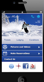
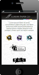
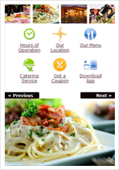
 Here is a list of a few tips to keep in mind when your designing your mobile UI (user interface & mobile navigation):
1. Brand consistency. If you have a current traditional website and landing pages that you'd like to mobile-optimize for smart phones and feature phones, your buttons aka hot spots should reflect similar names, labels and graphical feel for user consistency and identification.
2. Know your mobile audience and what your on-the-go visitors are looking for. Mobile visitors in most cases are needing different information than your desktop visitors, and your mobile content organization should reflect that.
What are your mobile visitors looking for? A good tool to get that information is Google Analytics, as well as putting yourself in your mobile visitor's shoes.
More...
 We've posted a blog article earlier this week on our new "hot spots" feature that allows our clients to upload their creative design files into piJnz and convert them into a custom mobile site quickly and so easily that it is fun!
This feature allows those looking to build unique and branded mobile experiences to bypass days (or weeks) of programming time and also avoid the lengthy testing and bug catching to ensure compatibility across popular mobile platforms.
Creating any (and we mean - ANY!) mobile look you want is now easier than ever, and is totally painless.
More...
 Here at piJnz we are super-excited about the new powerful feature that should change the mobile CMS world as we know it. In last week's release we've introduced "hot spots", which is the ability to add interactive action spots to any graphic you upload to your mobile website.

Why is this important?
Up until recently, when it comes to building mobile landing pages and websites, agencies and marketing professionals had two choices:
- Build cookie-cutter mobile content based on a mobile CMS platform. Yeah, you can change a few parameters such as your background colors and fonts, upload a different graphic, change widgets around and change icons. But - you can't change the structure (or the template) of the mobile page. After a while all the mobile pages you've created "feel" the same.
More...
 piJnz is kicking off the new year with a few exciting features:
1. piJnz is now integrated with MailChimp and ExactTarget, and working toward integrating with other popular platforms.
Now you can integrate any mobile form with a MailChimp or an ExactTarget account (a subscriber list or a group) and send your mobile form subscribers directly to that 3rd party platform. Or add a checkbox "Subscribe to our newsletter?" to your mobile forms and allow your mobile leads to opt in to your mailing list.
2. Gradients look slick on the mobile screens. Branded gradients matching the exact colors you are looking for are even better.
More...